There’s been a surge in reporting data using charts on the web. This has brought in the trend of infographics and several tools (JS libraries) that simplify the task of drawing charts.
Many people get too occupied in visual design and overlook whether the chart actually fits their use case though. Software charting libraries/plugins ought to be used judiciously and not plastered all over a report. The rotating dials and gradients on several corporate website homepages are usually just pointless and irritating. The graphics on Google Trends on the other hand are so useful cause they are crisp at presenting data. 10 years back the world wide web used to be full of hotch-potch gifs, flash and blinking orange/green lights on jet-black backgrounds! You have to be cautious not to do that with your graphics. What’s really bad is is sometimes the infographics end up representing the information incorrectly and can cause some serious damage.
I think that a simple 2D Bar or Line chart is what most people need when they instead pic some 3D chart graphic.
Here are my tips on how to go about creating a graph or a chart:
- Start with the problem — not by picking up a cool graphics library.
- Ask yourself if you have enough data. Use good statistical methods to analyse that data. If you aren’t ready to crunch the numbers, find help but don’t do it wrongly.
- Simple 2D representation with optimum contrast and colours that are easy on the eyes might be what you need. The decision on which chart to use comes at the end, pick 3D only if you need it, not because you liked a similar animated visual on some other website.
- Think about Accessibility: Use colours that are readable by colour blind people.
- Don’t leave it upon the user to figure out what is being said. That’s cognitive overhead which needs to be avoided.
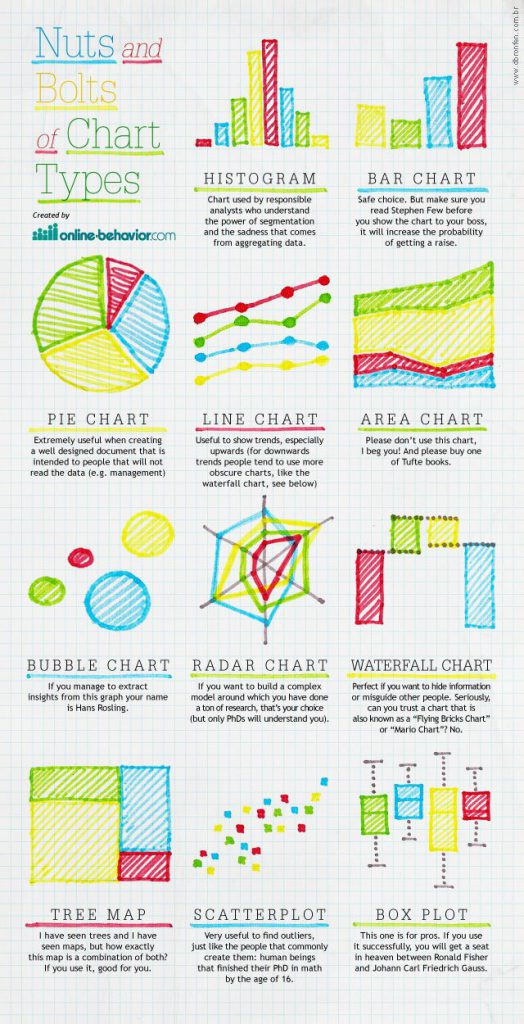
Here’s an interesting infographic showing the basic chart types

Leave a Reply