For any product company, understanding how their product performs is crucial in achieving growth. And data-driven decision-making can uncover hidden patterns and help align the products with its long-term vision. The Amazons and Googles of the world are successful because they have successfully used analytics at key stages of their product lifecycles.
Now of course not every startup should act like Amazon Google, or Facebook and there’s definitely something to be said about the gut feel, product aesthetics, and not blindly following data too. But still, when used consciously, data-driven decision-making can be of great help to any product manager.
It can be overwhelming to analyze fragmented data from multiple sources: so here are key concepts and methodologies which you can use as a guide for incorporating analytics into your strategy:
1. Vanity Metrics: Avoid the Temptation
Metrics such as page views or historical total downloads don’t always convey actionable measurements. They might make you feel positive about growth but think hard about whether you want to base your strategy on these. Every product is different! They are often (unfortunately) used to inflate growth figures but do not indicate real engagement or success.
Example: If a product shows high page views but low conversion rates, you need to investigate user engagement rather than just traffic.
2. Metrics vs KPIs
While metrics are measures of specific aspects of your product (e.g., number of users), KPIs (Key Performance Indicators) directly reflect progress toward your business objectives.
Example 1: your advertising spend is a metric, not a KPI. Advertising might help you get new users but the money spent is just a measure. A KPI could associate the sales increase with the advertising spend, i.e. cost of customer acquisition could be a KPI.
Example 2: While tracking user sessions is a metric, the KPI might be ‘User Retention Rate,’ which tells you how well your product is keeping customers engaged. Always ask yourself whether a metric drives actionable outcomes or just provides general insights.
To sum up, all metrics are not KPIs.
3. One Metric That Matters (OMTM)
Just like in your daily life, your startup needs focus! The OMTM is the most important metric that your team should rally around. In practice there might be 2-3 metrics that you might have to track, say sales, UX, and tech debt. But definitely keep this very low and below three.
Of course, your goals will change with time, so your OMTM evolves as your product and company mature.
Example: Early on, your OMTM might be “user acquisition,” while later it might shift to “revenue per user.”
4. Segmentation: Granular Insights Lead to Better Decisions
Segmentation allows you to break down your data by user attributes like geography, device, age, or behaviour. This helps in observing patterns more minutely instead of being lost due to averaging. As your product grows, you will gain an increasing ability to ask complex questions from your data and then you can optimize marketing efforts or product features for specific user groups.
Example: A product targeting millennials may realize that users from urban areas have higher engagement rates than rural users, leading to more targeted marketing efforts.
5. Funnels & User Journeys: Mapping Key Milestones
A funnel breaks down the steps users take as they move toward conversion. It helps you understand where users drop off and identify pain points in the user journey.
Example: If your signup funnel shows a large drop-off after the email verification step, it may indicate a cumbersome process or unclear instructions, providing an opportunity for improvement.
6. Retention
User retention is one of the most telling metrics of your product’s long-term health. Simply acquiring users isn’t enough if they don’t stay. By cohorting users (grouping them based on when they signed up), you can measure how product changes impact different groups over time.
Example: If users who signed up after a recent feature launch show lower retention rates, it may be an indicator that the feature has usability issues.
7. Data Points: Focus on What Matters
A Data point is a measurement that can be represented numerically or graphically. Here’s a more detailed Wikipedia definition. While it’s easy to get lost in data, not all data points are relevant to every decision.
Example: Focus on the key data points that align with your KPIs and business goals. Instead of simply tracking ‘all actions,’ narrow it down to those that affect revenue, user satisfaction, or growth.
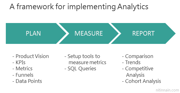
Implementing Analytics for Your Product: A 3-Step Approach
There are three broad steps you need to perform to setup analytics for your product:
Step 1: Plan
- Define Product Vision: Ensure you and everyone in the team understand the problem your product is solving.
- Identify KPIs: What metrics will indicate progress toward your vision?
- List Critical Metrics: Prioritize those that will guide your strategy.
- Plan the Funnels: Decide what actions matter most along the user journey.
- Data Points: Further drill down on where and how you’ll collect the metrics.
Step 2: Measure
- Use Established Tools: Focus on your core product instead. This is not the time to get political, whether AWS and Google Analytics are being monopolistic or not. Leverage tools like Google Analytics, Mixpanel, Hotjar for tracking. You can always reflect on these once you have substantial size.
- Collect & Store Data: You might want to set up separate databases to run regular queries for fetching metrics over time. Set up automated dashboards where possible.
Step 3: Report
Mark Actionable Insights: Focus your reports on KPIs, comparing trends with competitors, or tracking user behavior changes. Summarize the findings to share with stakeholders and guide future decisions.