The Apple Watch is releasing in a month! Here’s a list of important things you need to know, if you’re interested in designing or developing an Apple Watch App:
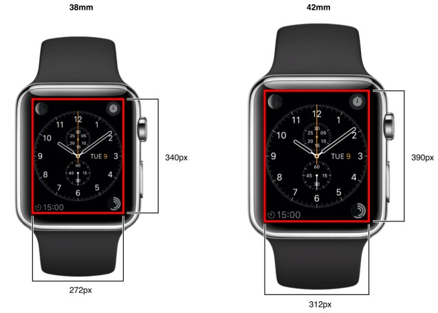
1. Layout and Screen Sizes
38mm: 340 pixels x 272 pixels
42mm: 390 pixels x 312 pixels
That’s an aspect ratio of 4:5.
2. Icon and Image Sizes
Unlike the Rounded Square icons on iPhones, the icons on the Apple Watch are round.
![]()
Icon Sizes Required:
38mm Watch: 48px, 80px, 172px
42mm Watch: 55px, 88px, 196px
Tips on designing the Icons (designers take note!):
– Create all of your image resources as @2x images.
– Create your icons as full-bleed square images using the given dimensions. The system applies the circular mask automatically.
– PNG format is recommended (for images and icons). Avoid using interlaced PNGs.
– The standard bit depth for icons and images is 24 bits—that is, 8 bits each for red, green, and blue. You can include an 8-bit alpha channel but doing so is not required. You can also use PNGs with indexed colors to save space in your image files.
– While designing these, also note that you’ll need the accompanying icons for the iPhone app. (i.e. Watch App can’t work without the iPhone App)
More information on Icons and Image Sizes.
3. Color
“A black background blends seamlessly with the device bezel and maintains the illusion of there being no screen edges. Avoid bright background colors in your interface.”
“Every app defines a key color. The system uses this key color for the title string in the upper-left corner of the screen and in notification interfaces to highlight your app name or other key information. You should similarly use the key color as part of the branding of your app.” More on colors.
4. Typography
There’s a system font “designed specifically for legibility on Apple Watch”. (the San Francisco Font). “Use San Francisco Text font for text that is 19 points or smaller; San Francisco Display font for text that is 20 points or larger.”
You can chose another font, but be careful to go for a dynamic font (that adjusts well to size — since the watch interface is so small). With Dynamic type, you get automatic adjustments to letter spacing and line height, text that responds appropriately to changes the user makes to text-size settings and more. More on Typography.
5. Two ways of navigating an App – Hierarchical Vs Page based navigation
From the start, you have to decide which type of navigation you want. A single App can’t behave as Hierarchical at one point and Page-Based at another point.

The two types are quite different in look, feel and the way they function. For instance, Horizontal swipes are only available for Page-Based Apps. More information on navigation types.
6. The three ways of presenting information
I. via the Main App
You can reach the App by launching the App from Homescreen. The ways of interacting with your Main App are rather limited right now.
Here’s what you can do:
a) Taps (selection)
b) Vertical Swipes (scroll through the screen)
c) Horizontal Swipes (go between pages – only available in page based apps.)
d) Force Touch:
Pressing the screen with a small amount of force activates the context menu (if any) associated with the current interface controller; this is the only thing a Watch app can do with force touch feature. More information on context menus.

Design of the Force Touch Context Menu can display up to four actions. The image for the context menu must be a template image — where the alpha channel defines the shape to draw on top of the background. Opaque portions of the image show up as black and fully or partially transparent portions let the background color show through.
e) Digital Crown: Only ‘scrolling’ support available to third party apps.
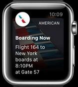
II. via Notifications
The wearer feels a gentle tap on the wrist when the Notification arrives.
Notifications are displayed up in two formats.
a) The “Short Look” is only seen briefly when you raise your wrist — it’s an app icon, an app name, and some brief information.
That is, the Short Look provides a discreet, minimal amount of information — preserving a degree of privacy. If the wearer lowers his or her wrist, the Short Look interface disappears.

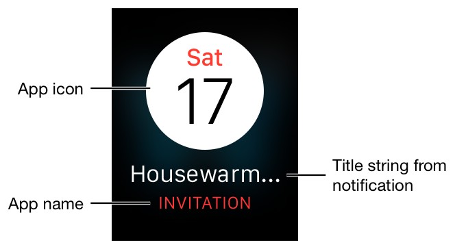
b) The “Long Look” interface appears when the wearer’s wrist remains raised or when the user taps the Short Look interface. It provides more detailed information and more functionality — and it must be actively dismissed by the wearer.
For Long Looks, the app icon and name move to the top of the screen, and wearers can scroll down through the interface to use custom actions (such as “comment” or “favorite”) or dismiss the notification.

Read More about notifications.
III. via Glances
Glances from all the apps are viewed together at a common swipe-able place. User can tap on a glance to enter the App. All the information on a ‘glance’ must fit on a single screen and is read-only. As the name suggest glances are there to provide the user useful information; don’t use them to spam the user. The area at the bottom of the glance is reserved for the page indicator dots. Read more about glances.
7. Image Cache
You can store upto 20MB of image resources in cache on the Apple watch. As with webpages and Apps managing caches efficiently is a hallmark of good front end; so plan your cacheing strategy well. Needless to say use very optimized images. More information on how to use images in the App.
8. Animation
To create animation you can loop through “sequentially named images”, infinitely or till a specific count. There’s no mention of support for videos or UIKit like animation.
These links have good info on how to show animations on Apple Watch:
http://natashatherobot.com/watchkit-animate/
http://www.raywenderlich.com/94672/watchkit-faq
9. Handoff
Handoff feature can transfer the user action from the watch to the iPhone. Handoff can also be used to dynamically send some information to the main Watch App interface using Notifications or Glances.
10. Fullscreen Support (Not available)
There’s no mention of fullscreen support for an app. (The only few seconds that your app will have the fullscreen of the watch to itself is during the short look notification.)
11. Settings Bundle
Works the same way as the iOS settings bundle. “Preferences are pieces of information that you store persistently and use to configure your app. Apps often expose preferences to users so that they can customize the appearance and behavior of the app.” More information on the settings bundle on the Watch which complements the existing settings bundle on iOS.
12. Date and Time
Use Date and timer objects whenever you want to display a current day or time or implement a precise timer. Date and time labels come in variety of formats suited for the watch. Generally, it’s a bad idea to invent your own date time format. More info on date, time formatting here.
13. Dependence on iOS App
Apple Watch requires the presence of an iPhone to run third-party apps.
“A WatchKit app complements your iOS app; it does not replace it.”
“During installation of your iOS app, the system prompts the user to install the WatchKit app when a paired Apple Watch is present.”
Further Reading
• Apple’s Human Interface Guidelines (HIG) for the Watch (Approximately 2hrs read)
• WatchKit Programming Guide
• WatchKit Framework Reference (for programmers)
• Apple’s tips and best practices for developing Watchkit Apps.